

Disney+ UX Redesign
WELCOME TO THE DISNEY+ REDESIGN
0.0 | CLIENT OVERVIEW
Disney+ is a subscription video streaming service operated by The Walt Disney Company. It was released on November 12th, 2019 and has its services in forms of a website (disneyplus.com), mobile app, TV, game console, and tablet.
It has a monthly paid subscription of $6.99 and focuses on “Family-oriented entertainment” with no R-rated or TV-MA-rated programming.
As of February 3rd, 2020, Disney+ has around 28.6 million users.
DURATION: 11 Weeks
TEAM
Timothy Joo
Peter Yim
Jayna Wang
Samuel Lee
Celia Lyu
TOOLS
Figma
Adobe Photoshop
1.0 | INFORMATION ENVIRONMENT
1.1 | CURRENT STATE
Disney+ is a relatively new streaming platform that caters for a wide range of audience. We found that in order to be able to compete in the streaming market against big name brands like Netflix, Disney+ must optimize and improve the experience of its platform.
1.2 | CURRENT APPROACH TO tHE INFORMATION ARCHITECTURE
2.0 | KEY ISSUES
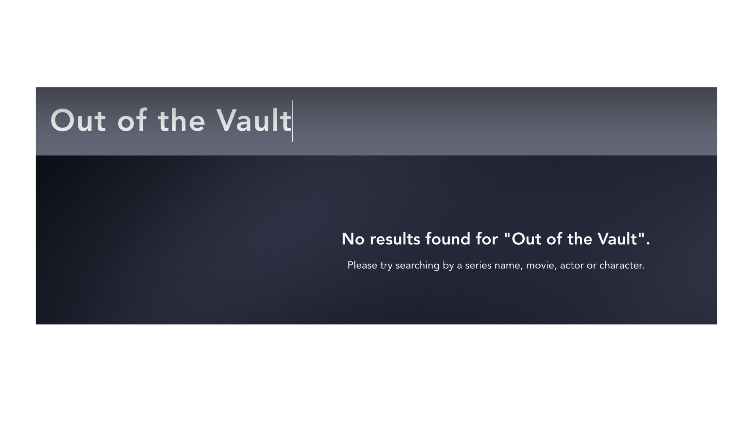
2.1 | INCONSISTENT SEARCH
Synonymous terms do not show up
Disney made categories do not show up
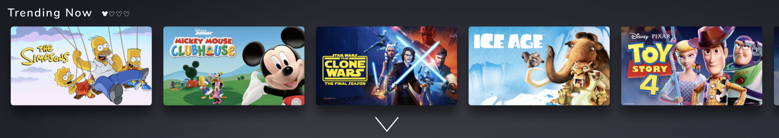
2.2 | CAROUSEL ISSUES
Users do not know where in Carousel they are
Users do not scroll through all of Carousel

2.3 | EXPLORE TAB LOCATION
Hidden in the search function of the website
For such a valuable feature, it is too difficult to find

3.0 | USER RESEARCH
3.1 | Initial Findings
For our initial research, we used our team of 5 members as users. Since many of us were unfamiliar with Disney+ (all but one), we consequently subscribed to the service to gain some experience.
Key Findings
The homepage was best for browsing
The search function would get the most use by us when we wanted to locate specific titles.
We found inconsistencies in the labeling, organization, and search.
Process
Account creation
Payment process
Navigating and viewing the content.
3.2 | Closed Card Sort
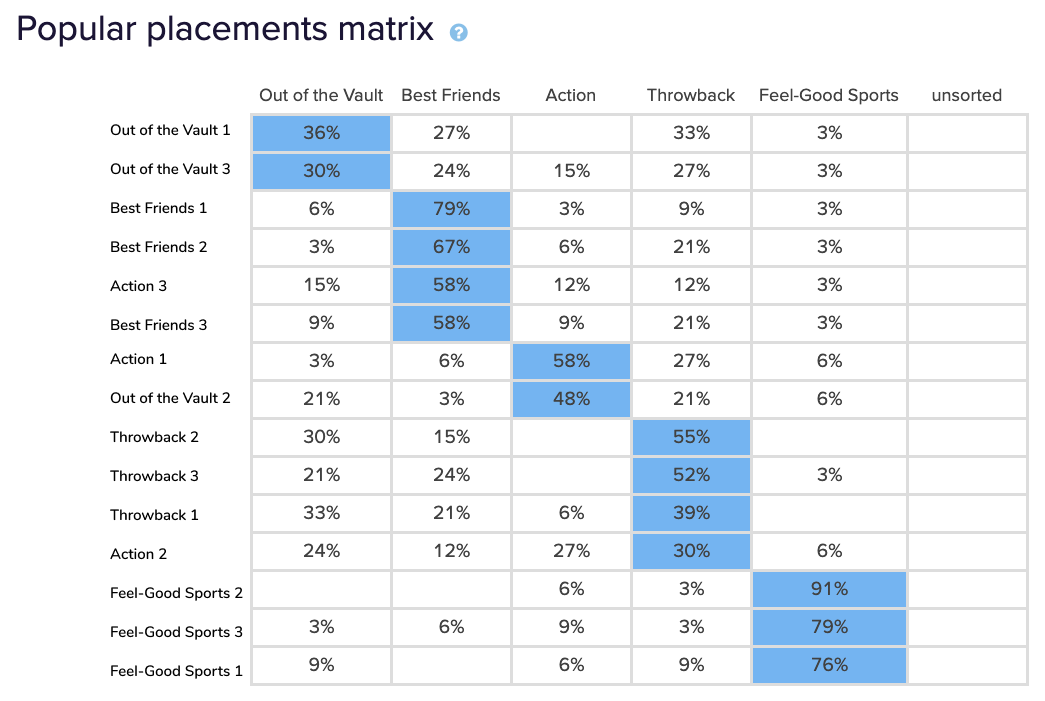
Then we used Optimal Workshop to conduct a Closed Card Sorting test and only tested people who were unfamiliar with Disney+.
Key Findings
Most of the time, users would match the wrong sort of show to its respective Disney+ category.
“Feel Good Sports” was the most effective labeling as 76% of people placed them
“Out of the Vault” had one of the lowest correct placements with an average score of 33%.
3.3 | Tree Test
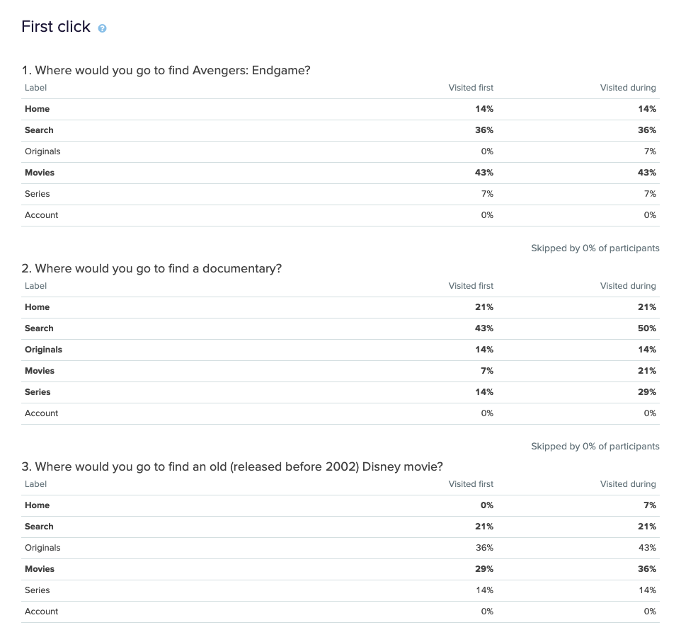
For the tree test, we asked participants to complete three tasks. This test was open to anyone so that participants could be current Disney+ users or could have no experience using it. The order of tasks was set to random so the results would be less biased from a learning curve.
Key Findings
Home, Search and Movies were the top choices.
Originals and Series often mislead our participants.
36% of participants expected older Disney movies to be found in the Originals category.
More than 20% of participants chose Originals as the final destination.
Participants were misled by Series because the filtering options within Movies and Series are very similar.
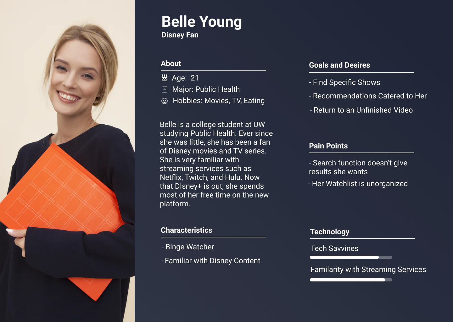
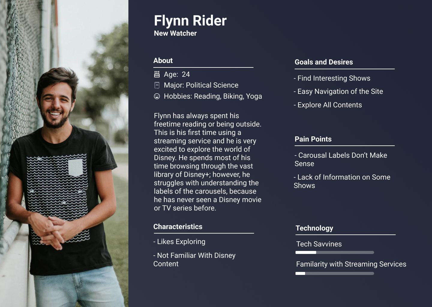
3.4 | Personas
4.0 | CURRENT APPROACH STRENGTHS & WEAKNESSES
4.2 | Weaknesses
Lack of label of titles
Organization is overloaded
Not consistent with how shows are categorized
Search function not optimized and can better fit the needs of the user
Lesser-known shows may be more difficult to find
Navigation can be tough
Lack of a filtering system
Carousels can limit how many users view shows
4.1 | Strengths
Appealing Visual Design
Good choice of photos
Easy to find show if you know what you are looking for
People utilize the streaming service and are loving it thus far
4.3 | Competitive Analysis
Due to the relatively small market of streaming services and the newness of Disney+, a competitive analysis is needed to see how the current market stands. As a team, we looked at the biggest competitor in streaming services, Netflix.
STRENGTHS
Has many similarities between UI and the organization of shows that Disney follows.
Carousels and global top navigation bar are how both sites allow users to explore through their show.
A very consistent categorization system with a detailed filter system of many of its genres.
A quick easy view of show information makes exploration of their website seamless.
WEAKNESSES
System design is displayed mainly through Carousels
5.0 | RECOMMENDATIONS FOR IMPROVEMENT
Recommendation Summary
Organization Systems
Labeling Systems
Navigation Systems
Search Systems
Controlled Vocabulary
5.1 | Organization Systems
5.1.1 | Icons
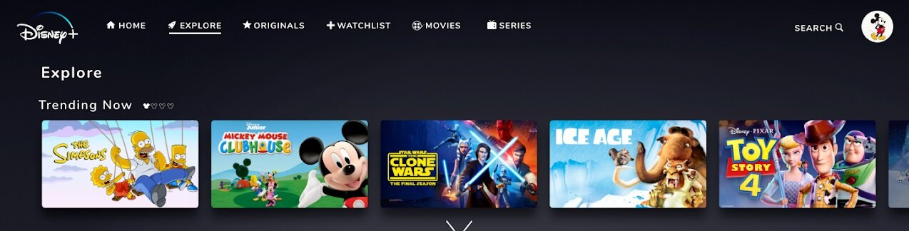
The first problem we found is that users usually do not tend to go through the full range of Carousels. We want to add icons to let users know and understand what cycle of the carousel they are at and know how close they are to reaching the end.
5.1.2 | Drop Down Arrow
People during our User interviews said that they did not like clicking on the arrow on the side of the webpage to view all the shows under one Carousel. We decided to add a drop-down arrow under each Carousel so that when users click on it, all the content within that Carousel will appear.
5.1.3 | Global Search Function
A global search function was needed to separate it from the explore page. This way, the explore page can act as its own global tab where it features new Disney content.
5.1.4 | User Personalized Watch List
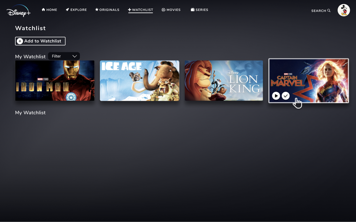
Originally, users would see all movies and series displayed in a random way on the Watchlist Page. By examining other streaming services such as Youtube and Spotify, we decided to add a “create your list” function so that users can make multiple watchlists named by their preferences. Within the users’ own list, movies and series will be organized alphabetically.
5.2 | Labeling SystemS
5.2.1 | Disney+ Original Thumbnails
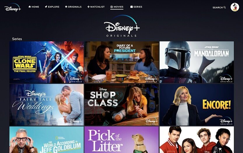
From our tree test user research, we found that Originals label often misleads people when they were searching for an older (released before 2002) Disney movie. For the Originals tab, we decided to add Disney+ Originals logos to every thumbnail, to make it more intuitive that the term “originals” does specify films specifically made for Disney+ rather than old Disney movies.
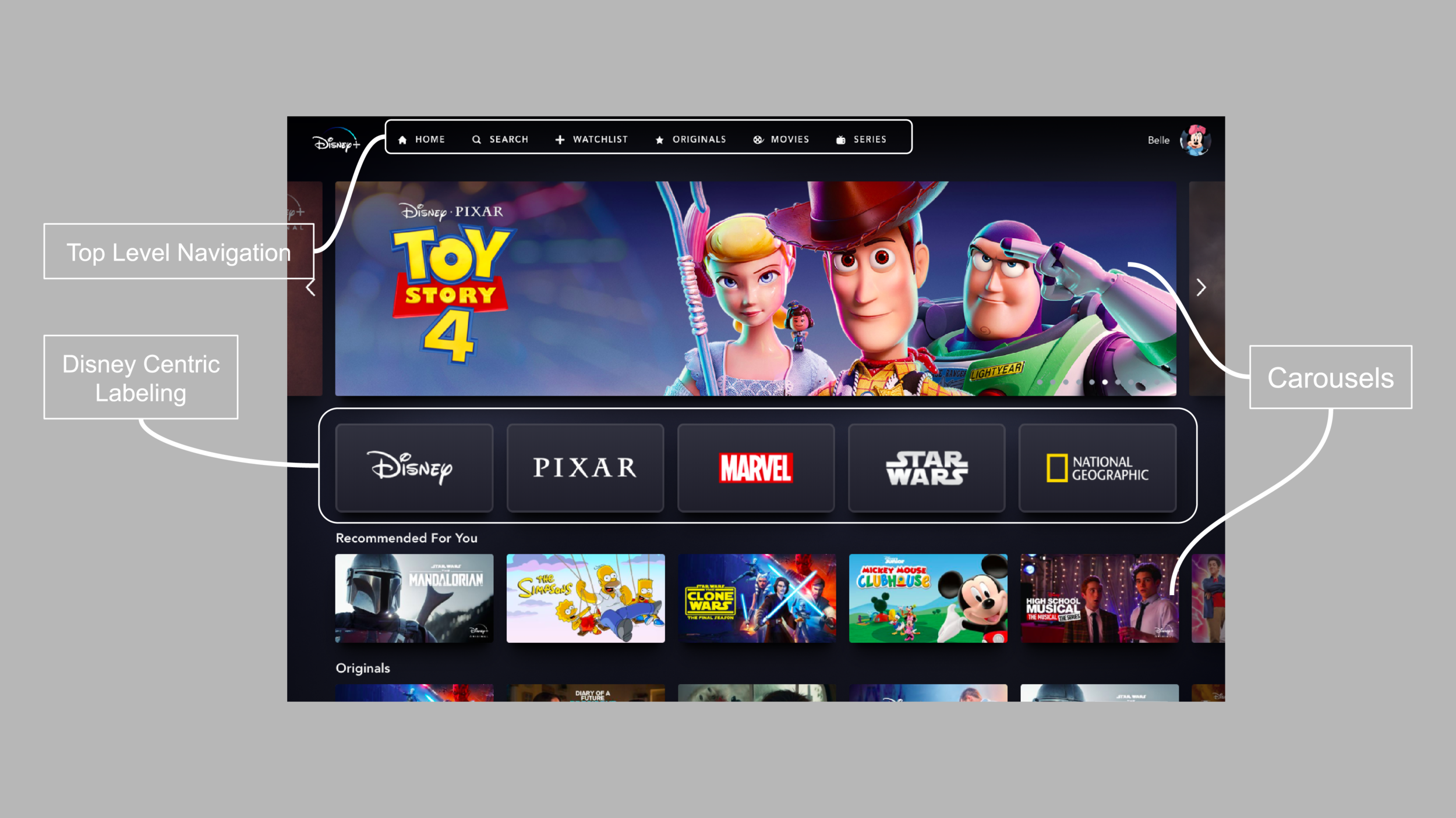
5.2.2 | Top-level Navigation

Based on our tree test, we found that the Series tab often misled people. Series is Disney+'s label for categorizing episodes and Disney shorts. When asked to locate where they think to find Avengers: Endgame, some tree test participants first clicked Series and then Action/Adventure. We predict this occurred because they may have assumed the series label indicates that the Marvel series of movies could be found there.
To solve this problem we decided to add an indicator on the top-level navigation to label which page the user is on, so they can always find where they are within the site.
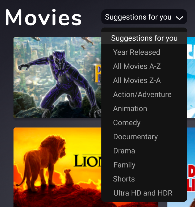
5.2.3 | Filter Options
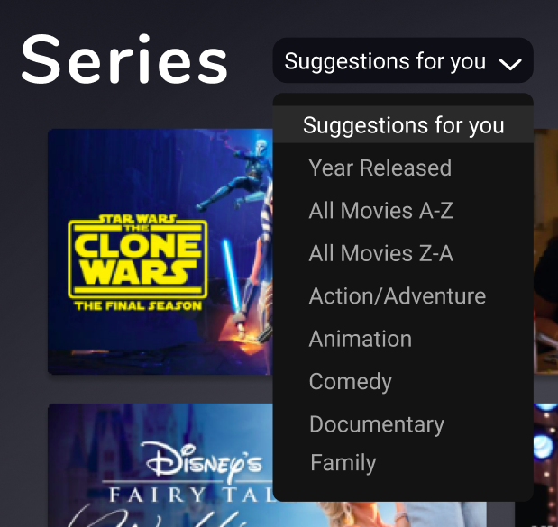
We updated the filtering options on the Movies and Series pages to be more intuitive and descriptive.
The current page uses the term “Featured” to label their featured content.
“Suggested for you” is meant to be more descriptive for the user and have a more personal feel.
5.2.4 | More Filter Options
We added more categories like “Year Released,” “All Movies Z-A,” and changed “Kids” to “Family.”
“Year Released” is meant to help users locate old or recently released movies more efficiently.
“All Movies Z-A” is meant for users to easily locate movie titles that begin with letters that come from the end of the alphabet.
“Family” replaces “Kids,” because “Kids” is redundant and competing with the already existing Disney+ Kids platform.
5.3 | Primary Home Page Navigation
5.3.1 | Search Function Location & Added Explore Section

At the moment, to get to Search, the user needs to go to another page. We want to change this location to the top right corner and have the search function to become more integrated and require less friction for the user to encounter.
With this explore section, we are still utilizing a page to display any recommended title that Disney is hoping for the user to watch. This section will give more in-depth options such as popular, coming soon, trending now, and recommended for you.
5.3.2 | Indicator Bar & Description
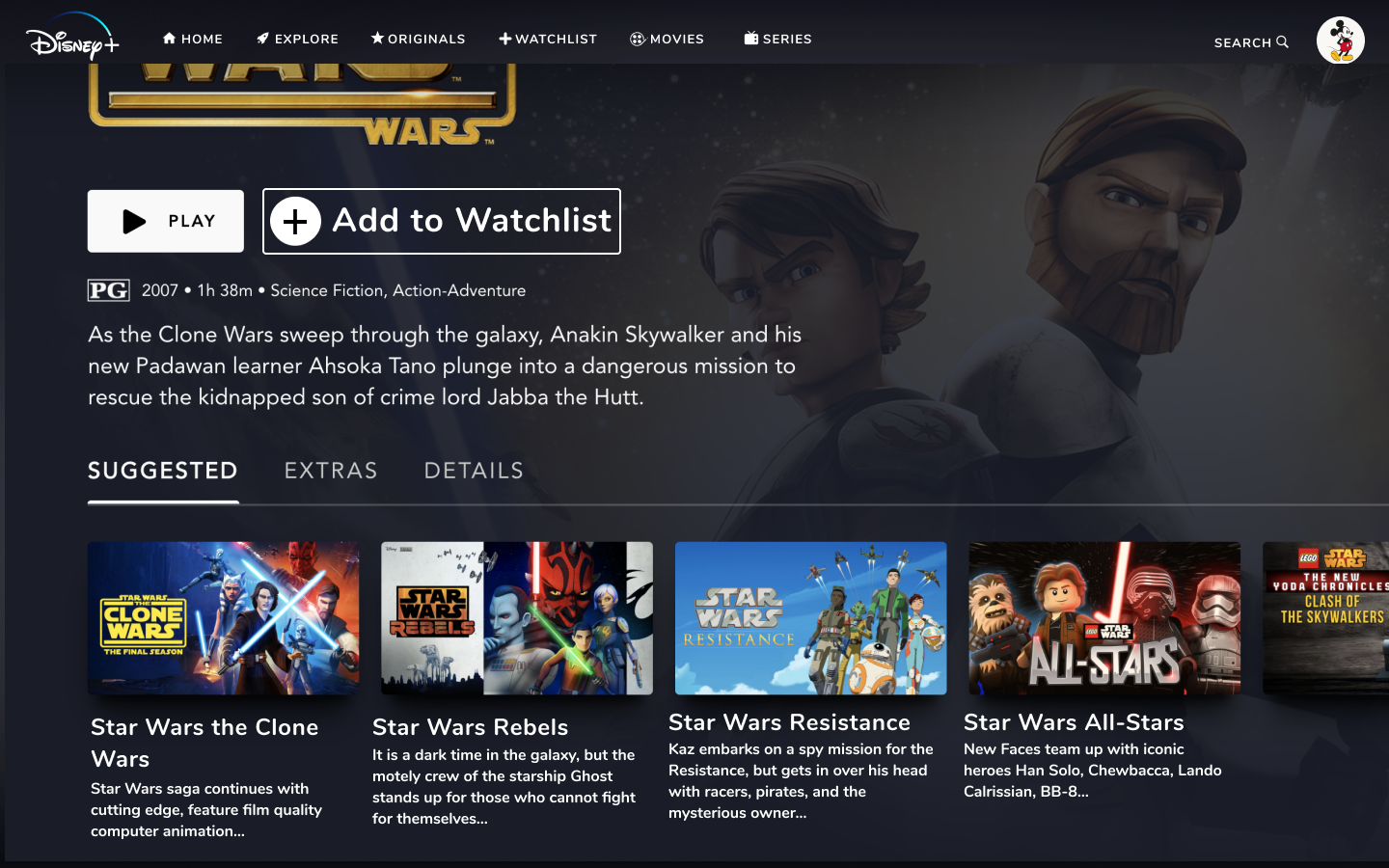
We are implementing an indicator bar next to the category title of the “Continue Watching” carousel on the home page. This function would allow the user to understand and see how large the carousel might be as well as give the user a better sense of whether or not they want to continue in that category,
We also included a description under the recommendation tab as people will need to know what these shows are and how they are relevant to the user. Disney+ in its current model lacks this extra type of information.
5.4 | Search
5.4.1 | Global Search

We separated search and explore in order to provide a global search without having users to switch between pages. As a desire for many of our users, this allows for a more seamless experience while exploring new content.
5.4.2 | Optimized Search
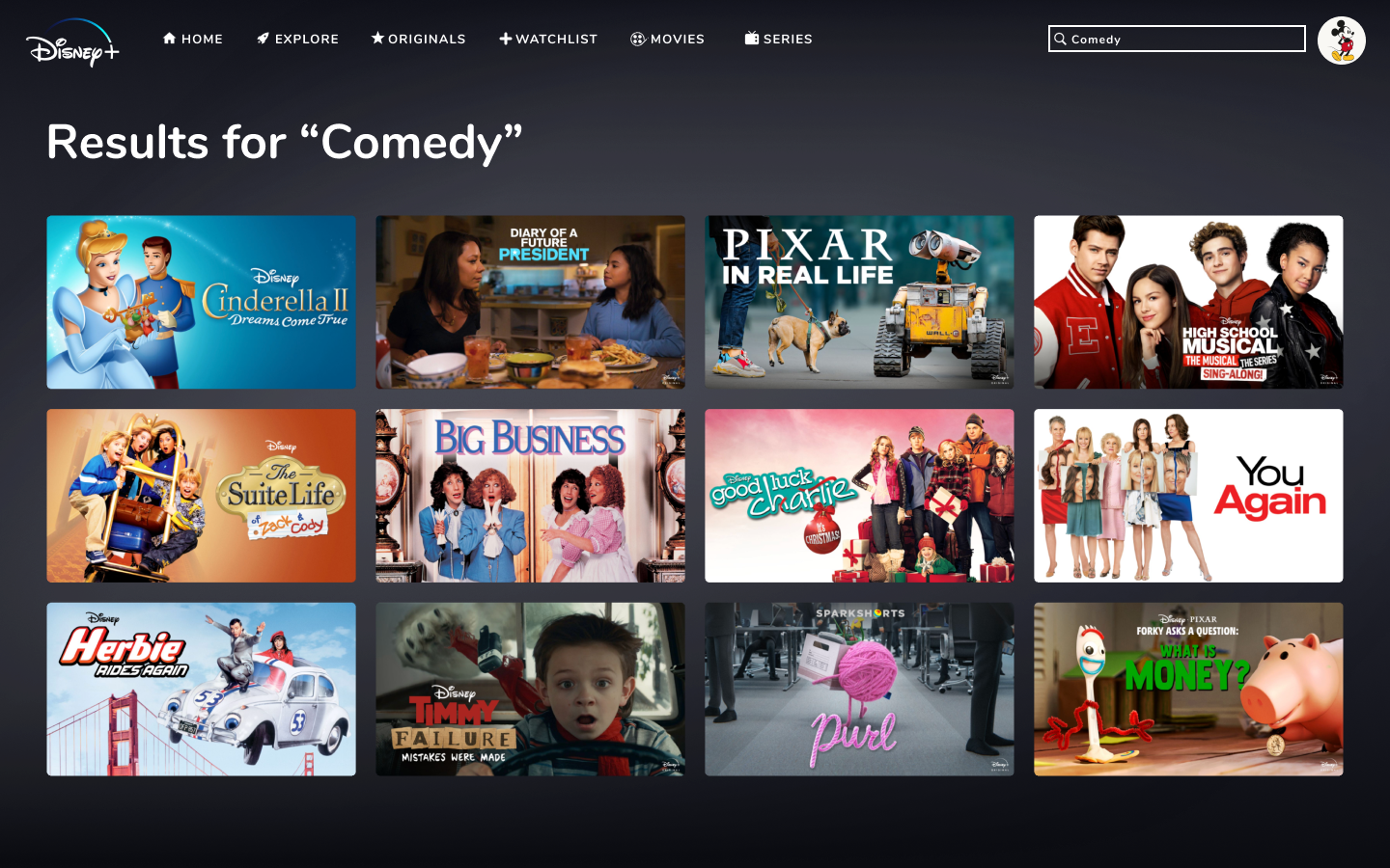
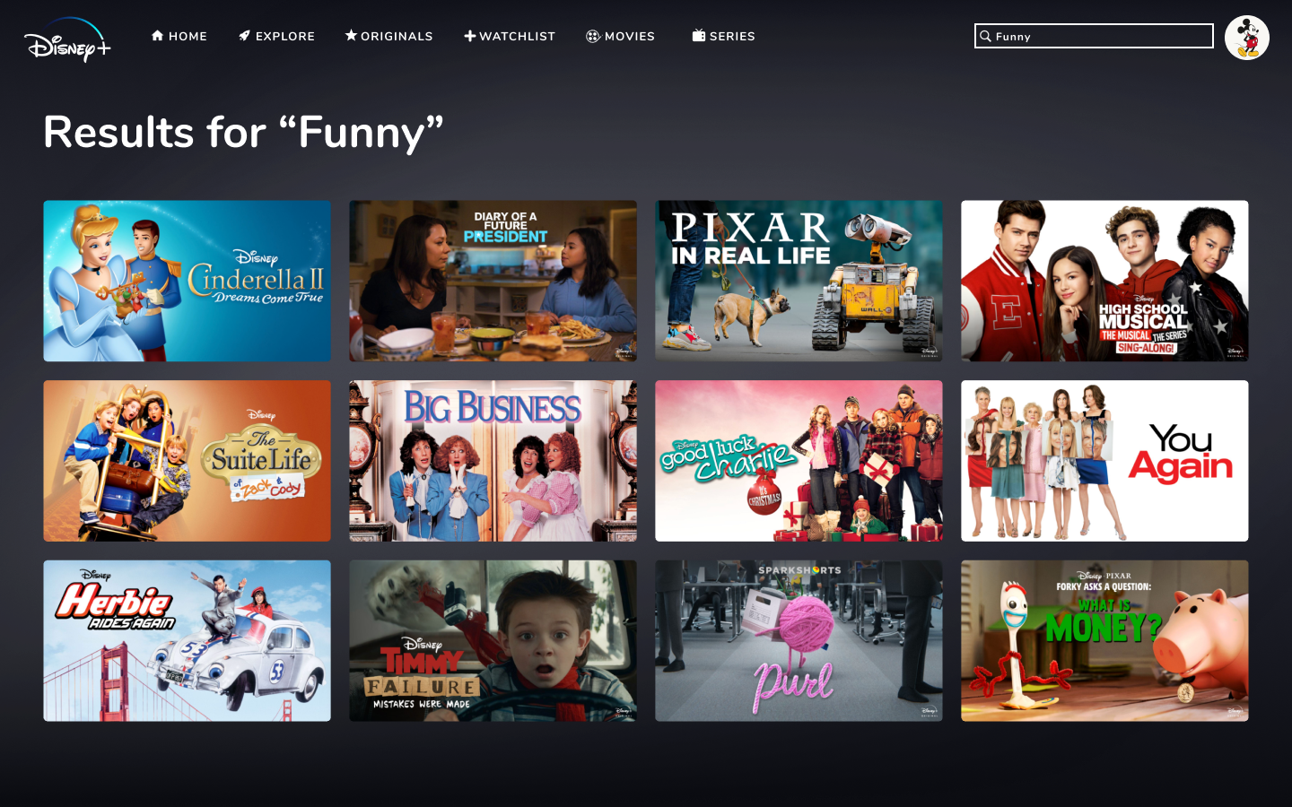
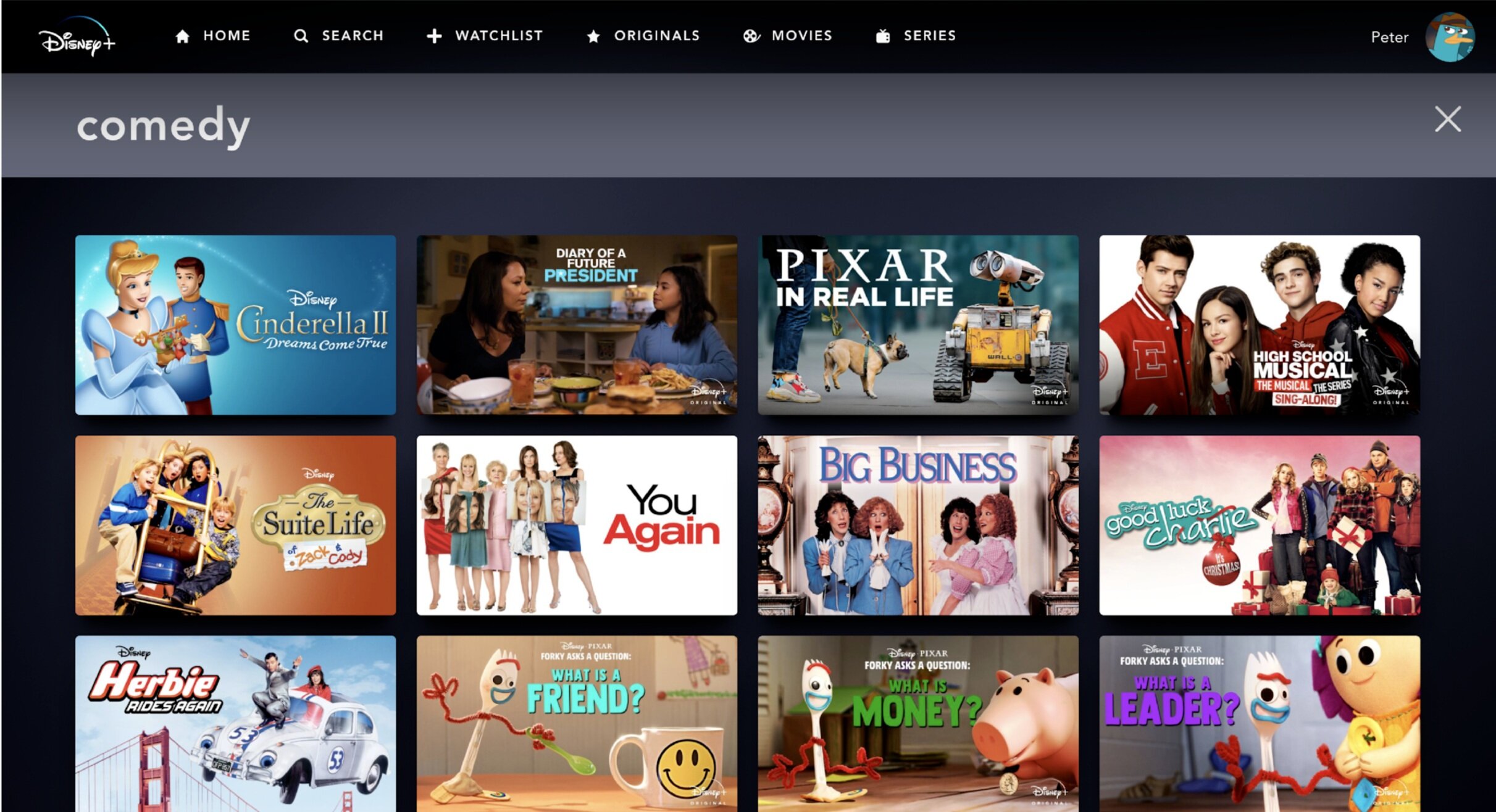
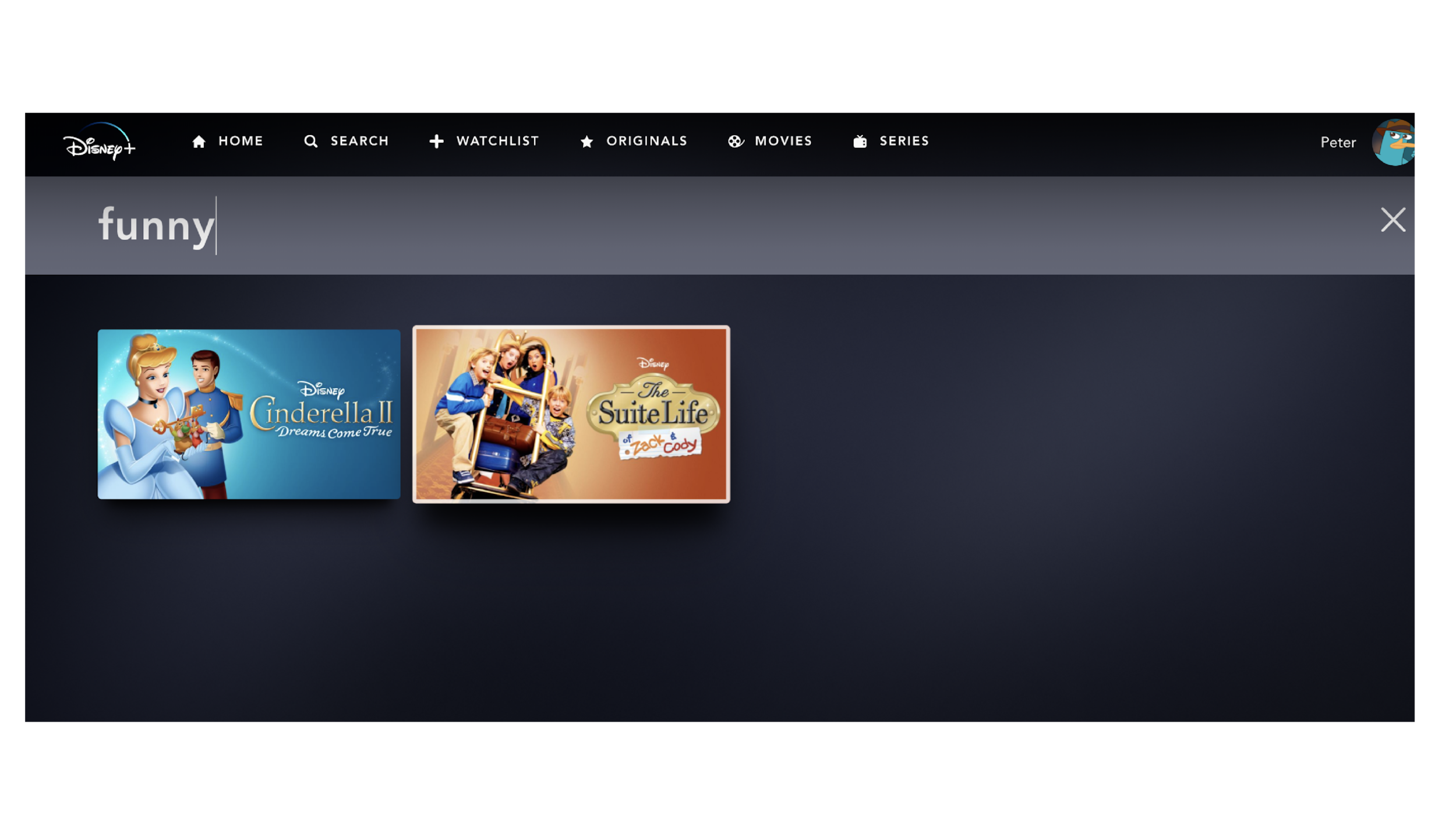
At the same time, the search is now better optimized with a consistent search result function. We will also implement a synonym ring that allows users to have consistent results when looking up similar genres such as comedy and funny.
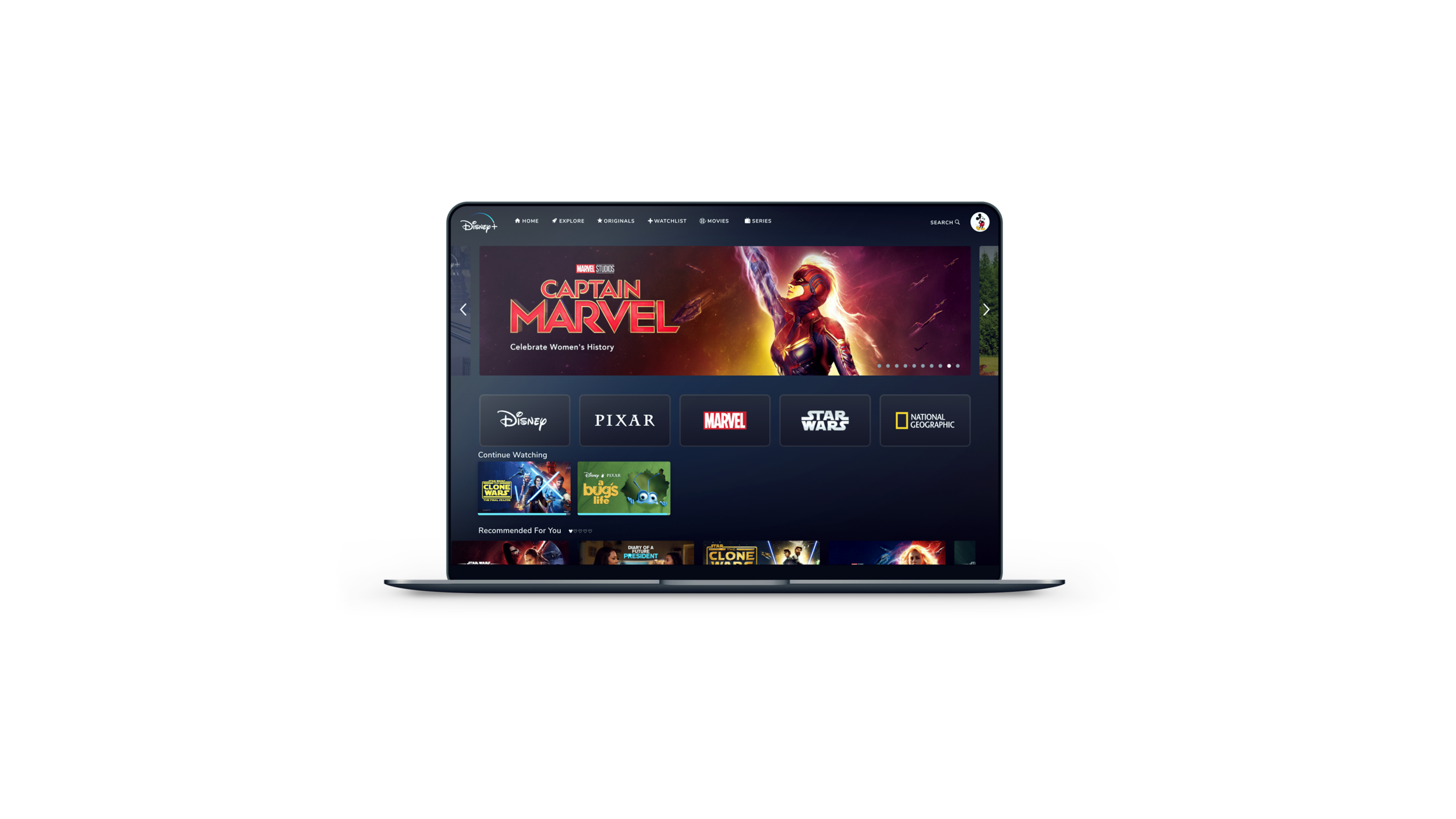
WIREFRAMES + FINAL PROTOTYPE
LIMITATIONS
We were only able to collect research on college students.
We acknowledge that families are a target audience for Disney, but families were outside of the scope of our project.
Similarly, Disney+ for kids was outside of our scope.
We did not look at any other platform besides Desktop.
We could not change much in terms of Vocabulary control due to the issue being mostly backend.
We could not change the recommendation system as it is also a backend issue.
The algorithms for how shows are displayed/recommended are beyond our control.